A Visual Style Guide for Technical and Scientific Images
If your illustrations and visuals confuse, distract, or mislead, you’re not communicating effectively.
Let’s dig into some best practices for delivering your message visually. There will be lots about the effective use of color. Throughout this article, you’ll find sources, links, and references.
Before Designing Something, Stop and Think
Every technical or scientific visual should do three things:
- Communicate a single message.
- Prioritize signal over style.
- Reduce interpretation error to near-zero.
So ask yourself three questions:
- What message do I want to convey?
- Who is my audience, and what is their prior knowledge?
- What information is essential to communicate the message to my audience in a rigorous, transparent, and exhaustive way?
Your Narrative in Words
A helpful exercise is to write down, as concisely as you can, the message you want to convey and check back with it throughout the design process. Test prototypes with a representative group. See if the message they take away matches what you intend, and use this feedback to improve your illustration.
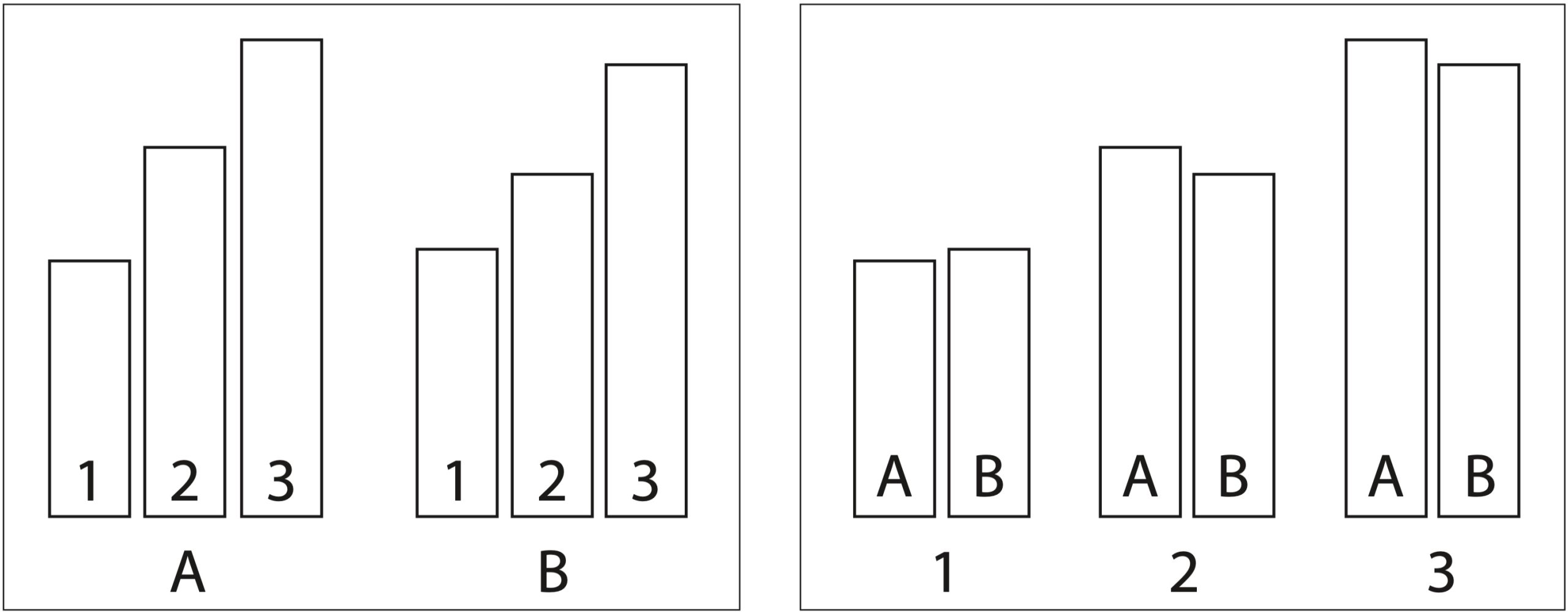
For example, the left and right-hand visuals above show the same data in different layouts. If your message is that there are subtle differences between A and B in the data, then the right-hand visual conveys this message more clearly than the left-hand visual.
Your Narrative in Colors
When choosing colors for an illustration or a rendered image, less is always more.
To start, here are a few rules of thumb:
- Create your image with greyscale alone, if possible. Then, assign color to the most important elements first to ensure the use of color is intentional.
- Use as many colors as necessary, but as few colors as possible.
- Always use cooler colors (or white) as background elements and warmer colors for foreground elements.
- Saturation can convey importance. Use rich colors only on the most important elements, drawing the viewer’s eye to them and leaving the rest of the image in pale colors or even white/grey.
For example, suppose you’re an AI researcher and you want to present an animation of a bot. Which of the images below is more readable?
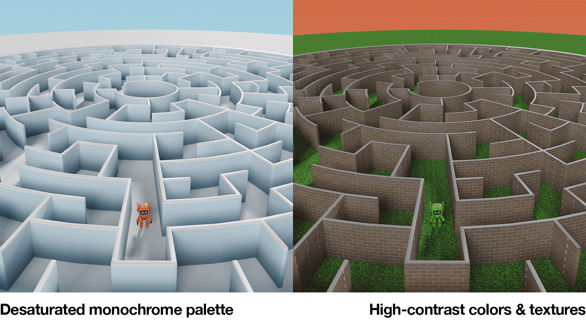
The image on the left uses a desaturated monochrome palette for the background and a strongly saturated color for the bot, making it the focus of attention. Furthermore, the pale blue background corresponds better to what our eyes expect to see in the world.
By comparison, the image on the right uses high-contrast colors for the environment, making the bot harder to see. Furthermore, the background color is a very warm shade of orange, which would be better suited for a foreground element. Finally, the textures used are unrelated to the story of how the bot behaves, and they simply add clutter.
Review and Feedback
Always check your visuals with someone who is representative of your audience. As you make revisions, ask yourself:
- Is the visualization clear and concise?
- Are colors and annotations consistent?
- Does the imagery enhance understanding?
Designing 2D Graphs and Charts
An excellent resource for creating illustrations for scientific journals is a paper titled Ten Simple Rules for Better Figures by Nicolas P. Rougier, Michael Droettboom, and Philip E. Bourne.
The rules, summarized:
- Know your audience so you can tell the correct story.
- Identify your message so you know what to include (and what to leave out).
- Adapt your figure to the medium, be it print, screen, or slide presentation.
- Captions are not optional because context always matters.
- Do not trust the defaults in your charting software.
- Use color effectively so your message is not buried.
- Do not mislead the reader by including extraneous data or omitting pertinent information.
- Avoid “Chartjunk” that clutters a figure unnecessarily.
- The message trumps beauty because information is the key thing.
- Get the right tool to make your life easier.
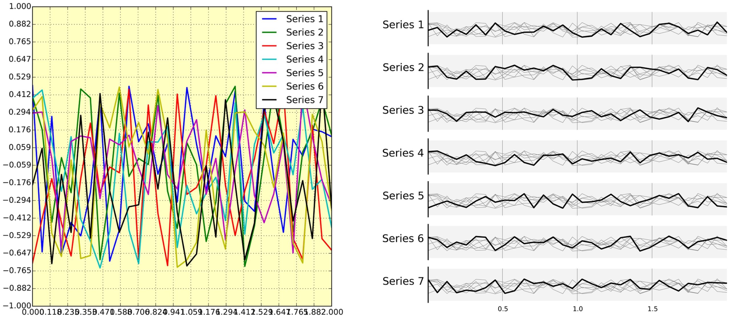
Above is an example of “chart junk.” The left-hand image was automatically generated by the plotting software and shows all the curves confusingly overlapped, supposedly for comparison. Further, the legend overlaps the curves, and the labels are crowded. By comparison, the right-hand plot separates each curve for clarity. From the paper by Rougier, Droettboom, and Bourne.
Tools for Choosing Colors for Technical Illustrations
Select a collection of harmonious colours and stick to it for consistency. Below are a few of the many tools available for selecting color palettes:
- Adobe Color to create color palettes from scratch and check for accessibility issues.
- Coolors to auto-generate color palettes.
- Viz Palette to help data visualization designers evaluate and improve their palettes.
- ColorBrewer for some predefined palettes and a comparison viewer.
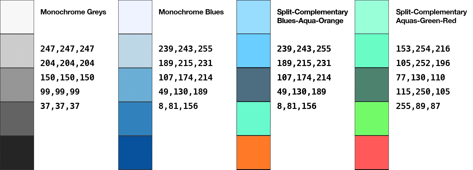
General Rules for Color in Technical Images
- Use cool and warm colors appropriately. Try to use cooler colors (e.g., blues, aquas, purples) for background elements and warmer colors (e.g., reds, oranges, greens) for foreground elements.
- Limit the palette to four or five colors per visualization to avoid visual overload.
Here are three useful ways to group colors:
- Complementary colors for the strongest possible contrasts (e.g., blue and orange).
- Analogous colors for harmony (e.g., blue, teal, and green).
- Split-complementary colorsfor a harmonious environment with a key element highlighted.
Below is an example of a split-complementary color palette. It provides four colors for a harmonious background while featuring one strongly contrasting color to highlight an object of interest.
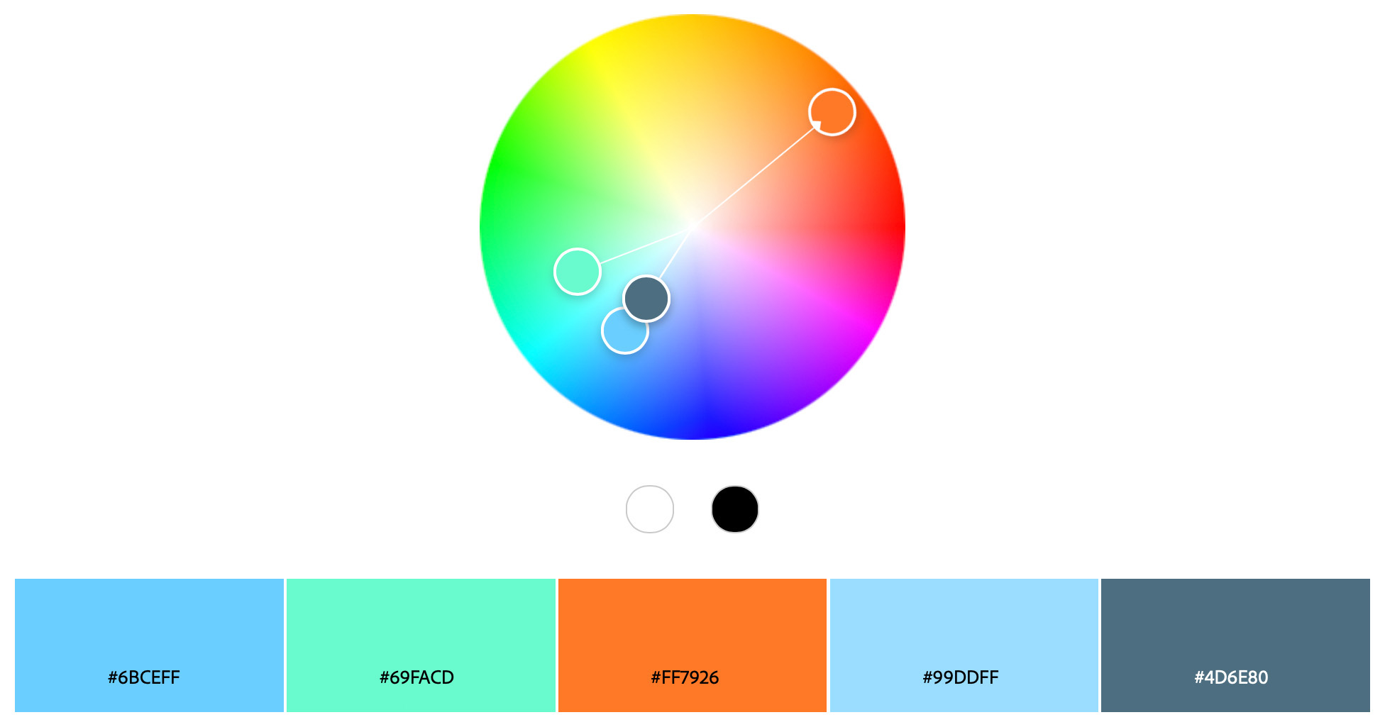
Below is a sample image designed with the same split complementary color palette. Blues were used for the walls, green for most of the robots, white for the ground, and finally, orange for the robot that is the point of interest.

Color Palettes to Get Started (with RGB Values)
When designing any visual, start with white/grey/black and then add colors incrementally.
Backgrounds
The backgrounds for your figures should match the medium where they will be used:
- For research papers or white papers, use a white background whenever possible.
- For slide decks, use a grey value similar to the brightness of the slide deck or, if appropriate, a transparent background.
- For videos of animation, start with a featureless light grey or dark grey background, depending on what provides the best contrast with the subject.
However, if the background itself provides necessary context (such as a specific environment), feel free to disregard the above.
Colorblind Accessibility
Color blindness affects approximately 1 in 12 men (8%) and 1 in 200 women (0.5%). Red-green color blindness is by far the most common form, which means that red and green look very similar to people with this form of color blindness.
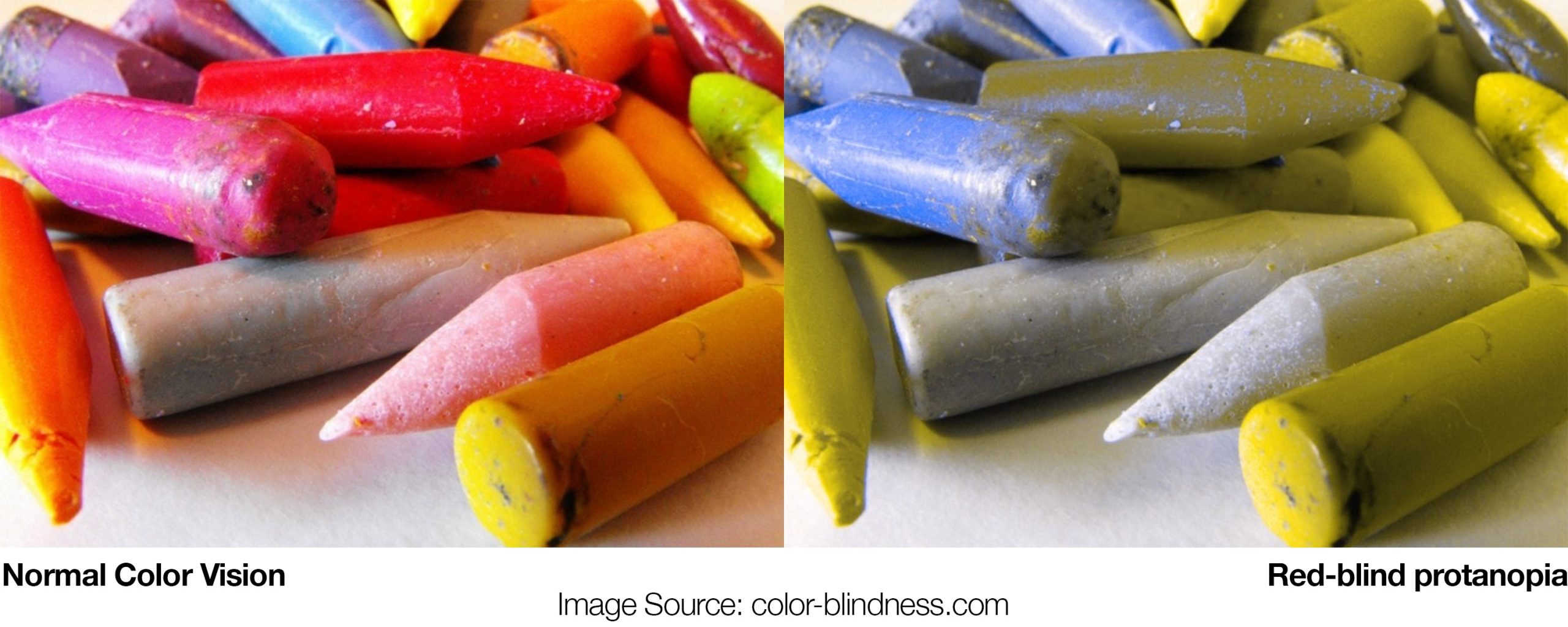
When choosing a color palette or preparing an information graphic, be sure to:
- Test visuals with simulators such as:
- Coblis Color Blindness Simulator allows you to upload images and view them as someone with color blindness.
- Adobe Color palette generator has accessibility checking tools.
- Contrast Checker can tell you the contrast ratio between any two colors. A good rule of thumb for text is a contrast ratio of at least 4.5:1.
- Avoid using red and green to represent distinct states or types of information unless you can control the brightness and saturation of the colors to ensure they are distinct for all people.
- Try to avoid using different colors alone as signifiers. Labels and shapes provide added context.
More Resources
Some of the above was adapted from the paper “Enhancing the Accessibility of Climate Change Data Visuals” by Harold, J. et al. at the Tyndall Center for Climate Change Research. For more information about their standards for visualizing scientific information, check out the recommendations in their paper.


